


OUR PRODUCTS IN ACTION
Tutustu uusimpiin tuotteisiimme: Katso miten luot meikkilookeja ja lue käyttäjien arvosteluja!
Virtuaalinen meikkistudio
Virtuaalinen meikkityökalumme auttaa sinua löytämään inspiroivia lookeja ja kokeilemaan meikkituotteita. Kulmien muotoilusta uuteen maskaraaan, virtuaalinen meikkistudiomme auttaa sinua löytämään sopivimmat meikkituotteet.
Virtuaalinen sovitus
Aika kokeilla meikkejä! Kokeile meikkituotteita, sävyjä ja lookeja Virtual Try On -työkalun avulla.
Katso lisätietojaUudet tuotteet
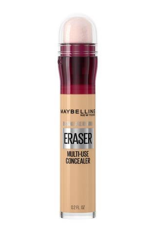
-
Liquid-to-grip-tekstuuri
-
Heleä mattapintai
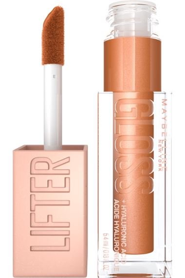
-
Kerrostettavaa
-
Pehmeän värinen huuliväri
-
Pehmeät, täyteläiset


MEIKKILOOKIT
JA VINKIT
Tutustu trendikkäisiin lookeihin tai ota nämä vinkit haltuun jo tänään!